Sunday, July 31, 2011

New Yorker Finalists

A lot of great entries arrived in the “New Yorker Unfinished Cover” contest. There wasn't room to show them all. It was very difficult to choose, but I’ve picked three finalists, and I’d like to ask you to vote for your favorite in the poll at left. (Poll now closed)


Kalliopi Monoyios  (266 votes--Congratulations, you're the winner)


Larry Roibal “The Debt Ceiling” (59 Votes)


Matt Soar  (70 Votes)

The winner will receive a signed and specially remarqued poster for Color and Light: A Guide for the Realist Painter. The New Yorker has promised to do a post on their official blog about this impromptu contest, and I’ll let you know when they do. There is a nice post on the Stretchbook blog.

Saturday, July 30, 2011

“Do not try to make a pretty picture”

When John Singer Sargent traveled to America in 1890, he went painting with Frederick S. Pratt, an amateur painter and founding trustee of the Worcester Art Museum.


Luckily for us, Pratt wrote down what Sargent had to say about painting methods.

“Choose simple subjects, near objects at first. Do not try to make a pretty picture so much as to render truthful effects. Paint over the whole canvas with colors approximating the masses so as to obscure [sic--did he mean establish?] relations of tones while working—when finishing, ‘paint into paint’ when possible and in portraits, paint around the features in detail, using small brushes rarely.


“Always use a full brush and a larger one than necessary. Paint with long sweeps, avoiding spots and dots (‘little dabs’). Never think of other painter’s pictures or how some one else would treat a subject but follow your own choice of colors with exact fidelity to nature.”

Quoted in the new book: John Singer Sargent: Figures and Landscapes.

Friday, July 29, 2011

Seeing Symbols

“Vision is nothing more than the creation of symbols in our head that represent what exists outside our body,” says Michael S. Sweeney, author of Brain: The Complete Mind.


Our brains encode the world to give it meaning. This encoding process happens automatically. People hear a car backfiring and think it was a gun. They hear a gunshot and think it was a firecracker. They feel an earthquake and think a heavy truck rumbled by.

The actual event is thus translated, accurately or not, into a symbol of the event. We react not to the raw data outside us, but to the symbol created in our minds. Both the complex structures of the cerebral cortex and the more basic emotional centers come into play in this visual response. According to Sweeney, “We react to the pictures in our heads instead of to the world itself.”

This tendency to see in symbols works both for us and against us as we try to represent the world in our artwork.

Brain: The Complete Mind by Michael S. Sweeney
Previously on GJ: The Arab Guard
The photo of me doing a street portrait in Fez, Morocco was taken in 2008 by Alan Dean Foster

Thursday, July 28, 2011

The Zorn Palette

Swedish painter Anders Zorn (1860-1920)  has long been associated with a limited palette of four colors. Rosemary Hoffman, in the book Northern Light: Nordic Art at the Turn of the Century wrote, “Zorn was noted for executing paintings using a sober color scale limited to white, ochre, vermilion, and ivory black.”


Hans Henrik Brummer, writing in the 1986 catalog on Zorn, said “basically his register was limited to black, white, earth yellows and vermilion; other pigments could be used if local accents were needed.”

Several art teachers, such as Jeff Watts, use the “Zorn palette” (sometimes substituting cadmium red light for vermilion) as a teaching tool because it provides students with a finite range of color choices with a wide enough gamut to handle most figure paintings. The gray can appear as a blue in the context of the limited palette.

But recently some authorities have cast doubt on Zorn’s use of the limited palette. 

Bob Bahr of American Artist magazine states that the so-called Zorn palette “may be a very useful tool, but it is a mistake to attribute it to Anders Zorn.”  Bahr cites Birgitta Sandström, the museum director of the Zorn Collections in Mora, Sweden, who claims that she has “difficulty even comprehending the assumption that Zorn worked with the specialized palette associated with him” because of the fact that blue and green are found in some of his paintings, and because those colors were found among his studio effects.

She reports that “17 tubes of cobalt alone are represented among the 243 tubes of paint left by Zorn in his studio in Mora.” Merit Laine, curator of prints and drawings at Stockholm's Nationalmuseum, “concurs that the notion of a Zorn palette is a bit of a misnomer.”


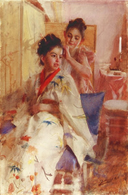
I don’t claim to be a Zorn expert, but speaking as a painter, I think these commentators are mistaken and have likely overstated the case. No one has suggested that Zorn exclusively used the ultra-limited palette. Obviously, many of his paintings (such as the one above) use a wider array of colors, including blue.

I believe there’s also a logical problem with the evidence of the surviving paint tubes. They don’t prove much. In my own case, the back of my paint drawer is crammed with dozens of colors. Some of them, such as Aubusson Green and Tuareg Blue, I purchased cheap and I never use; some I haven’t touched in 20 years. Some are so expensive I hesitate to use them. Some have caps or labels that fell off and I don’t know what they are. Some are so toxic that I avoid them like nuclear waste. Some are stuck to the bottom of the drawer in a pool of leaking linseed oil that turned to glue.

I often use limited palettes, but you would never guess it from looking in my paint drawer.

What evidence is there that Zorn used the famous four-color palette? First, many of his paintings appear to be painted within a narrow gamut that could have been painted from those colors.

 
Theoretically, one could paint such a picture from either a full palette or a limited palette. A chemical analysis would prove it for sure.

Many of Zorn’s heroes, such as Frans Hals, Diego Velasquez, and James M Whistler, used limited palettes. Talk about limited palettes among artists of Zorn’s day was commonplace.

There’s also the testimony of fellow painters writing about Zorn’s palette during Zorn’s lifetime. For example, European-trained Birge Harrison (1854-1929), in his book “Landscape Painting” in 1909, says: “The expert cannot be bothered with useless pigments. He selects the few that are really essential and throws aside the rest as useless lumber. The distinguished Swedish artist, Zorn, uses but two colors—vermilion and yellow ochre; his two other pigments black and white, being the negation of color. With this palette, simple to the point of poverty, he nevertheless finds it possible to paint an immense variety of landscape and figure subjects.”


Then there are the actual palettes that survive in the Zorn museums. This one may have a touch of cadmium yellow, or perhaps a dab of blue or green, but it’s a small palette and a small box, and it seems to emphasize the main four colors.


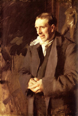
Finally, there is the self portrait, which clearly shows the palette with the four colors: white, ochre, red, and black. Zorn was conscious of his own image. He was aware that he was an artist’s artist even in his own day. He proudly showed off the four-color palette.

What the doubters need to understand is that a limited palette is not a sign of impoverishment, but rather of resourcefulness. As Brummer says, “limitation could, in fact, be an asset.” Zorn’s experiments with limited palettes were a part of his virtuosity, a token of his strength as a painter.

LINKS
"Sweden's Sargent" on the American Artist website.
Anders Zorn complete works (website)
Anders Zorn on Wikipedia

BOOKS
Northern Light: Nordic Art at the Turn of the Century
Zorn: Paintings, Graphics, and Sculpture
Landscape Painting by Birge Harrison
Color and Light: A Guide for the Realist Painter
Thanks, Tim Adkins for the palette photo.

See what's inside cute cartoon characters

Ever wonder what's inside "Hello Kitty?" More at "The Anatomy of a Toy" at Insane Twist.

Thanks, Frank!

Wednesday, July 27, 2011

The apocalyptic vision (and rotten luck) of John Martin

The art museum of Sheffield, U.K. is currently hosting a retrospective of the paintings of John Martin (1789–1854).


Martin’s grand apocalyptic vision has inspired movie makers and rock ‘n’ rollers for decades. This is the first exhibition of his work for 30 years.


Martin had a lot of bad luck. His father, mother, grandmother and young son all died in a single year. One of his paintings, accepted and hung in the Royal Academy, was destroyed when a careless worker spilled a pot of dark varnish all over it. His painting “Belshazzar’s Feast” was nearly ruined when the carriage transporting it was struck by a train.


The exhibit will continue until September 4 and then move on to the Tate in London.

 READ MORE ABOUT IT
Museums of Sheffield John Martin exhibition
 Wikipedia on John Martin
Book: John Martin: Apocalypse Now!
John Martin (with lots more links) at Lines and Colors

Tuesday, July 26, 2011

Why science needs art

According to an article on the Wired blog by Betsy Mason, science benefits when people draw their field notes by hand.


The results are not only beautiful, they're the most efficient way to record field observations.


Another reason artwork is so important in this age of photographic imagery is that illustrations can select and enhance features that photographs can’t. In this photograph of the skull of Daemonosaurus, it is very difficult to ignore the substantial cracks and deformation due to preservation. The line drawing makes it much easier to discern what is bone and what is rock.

Scientific American blogger Kalliopi Monoyios says, “Illustrators can ignore color variations and minor cracks and complete missing sections based on other specimens; essentially, we act as editors, pruning extraneous visual information.”

Read more at:
5 Reasons Your Camera Won’t Steal My Job.
Wired article on the value of field notes

Credits:
Monoyios’s art/science blog is called “Symbiartic.” The blog’s co-author is Glendon Mellow. Photograph by Chip Clark courtesy of the Carnegie Museum of Natural History. Skull illustration by Sterling Nesbitt. Thanks, Kalliopi and Darren.

Monday, July 25, 2011

Migration Period Art

Barbarians in fantasy paintings often wear ornate bronze jewelry or carry ornamental weapons.


(Tara Brooch, front view, early 8th century)
There’s a historical basis for such a decorative style. “Migration period art” is a term describes the ornate style of various cultures in the period between 300 and 900 AD after Rome fell and before the Church consolidated its power in the Middle Ages.


(Gundestrup cauldron, Denmark)
These roving groups included Huns, Angles, Saxons, Celts, Visigoths, Vikings and Jutes. Instead of lavishing their artistry on large permanent architecture or monumental sculptures, they created mostly portable works on carved stone and hammered metal.


Many of the design devices of Celtic illuminated manuscripts borrow design motifs such as spirals and scrolls, which were originally part of the metalworking tradition. 


(Sutton Hoo purse lid)
People were often buried with such goods to help them in their afterlife journey, until Christianity changed the practice.

LINKS
Migration Period Art on Wikipedia
Staffordshire Hoard on Wikipedia
Arts of the Migration Period in the Walters Art Gallery Hunnish, Gothic, Ostrogothic, Frankish, Burgundian, Langobard, Visigothic, Avaric, Irish and Viking
The Fall of Rome and the Art of the Migration Period

Sunday, July 24, 2011

Getting to know an iguana


An agreeable iguana puts up with his human friend explaining his teeth, claws, scales, tail, and his third eye.
Via Best of YouTube

Two Creamers

Here’s a little watercolor study that I made while waiting for breakfast at the local diner.


A good thing to keep in mind when painting highly reflective objects, such as these little stainless steel creamers, is that the more reflective something is, the greater the range of values needed to portray it.

Saturday, July 23, 2011

Tips for Painting Sunsets from Observation

The new issue of International Artist magazine continues my series on atmospheric effects with a feature article about painting sunsets. It includes the following tips on painting sunsets from observation.


1. To paint an oil plein-air study of a sunset, you have to premix the colors before the moment arrives, anticipating the effect you want to capture. You’ll probably need variations of background blue sky, clouds in shadow, and illuminated cloud colors.
2. When colors reach their peak, the light on your palette will be fading, so remember where those premixed colors are.
3. Use a separate brush for each family of colors to save wasting time washing out your brushes between mixtures.

4. You can also use a small LED flashlight to illuminate your palette area. The LED lights are good for this purpose because they give a reasonably white light. You can clip booklights to the brim of your hat so that they shine in the direction that you’re looking.


The new issue also has a "Day in the Life" of Everett Raymond Kinstler and a feature on Dennis Nolan, teacher at Hartford Art School and illustrator of many children's picture books.

LINKS
International Artist
Color and Light: A Guide for the Realist Painter
Dinosaur Dream  by Dennis Nolan
Dinosaur Dream

Friday, July 22, 2011

Advice for Anna

Danish painter Anna Ancher (née Brondum, 1859-1935) painted some of the finest works of the Skagen group of realists. She was married to fellow artist Michael Ancher.


(Above: Lars Gaihede Carving a Stick, 1880.)
Her accomplishment is doubly impressive, considering the discouragement she had to endure from people who thought her place was not at the easel.

Vilhelm Kyhm, her former drawing master, sent her a set of china as a wedding present, along with the note suggesting that she go down to the beach with all her painting equipment and set them “to sail the seas, because now, as a married woman, she would no longer want to be an artist, but a housewife.”

Thank you, Anna, for not listening to him!

from Northern Light: Nordic Art at the Turn of the Century, page 44.
Wikipedia on Skagen painters
Wikipedia on Anna Ancher
In Another Light: Danish Painting in the Nineteenth Century

Fantasy Art Essentials


Future Publishing, the people who come out with ImagineFX magazine, has pulled together some of their favorite articles into a 228-page bookazine that they call “Fantasy Art Essentials.” You can tell it’s about fantasy because it’s got a babe in a bronze bikini on the cover.

Featured artists include Charles Vess, Brian Froud, Syd Mead, Craig Mullins, Mike Mignola, and Jean “Moebius” Giraud, and plenty more.

Adam Hughes shares his Photoshop tips on turning a grayscale drawing into a full color cover. Marta Dahlig gives up her secrets for digitally rendering skin, hair, and fabric. And Dave Gibbons takes us through his process for doing a comic style cover.

And for those of you who missed my piece on visual perception from Color and Light and my IFX bio article, they’ve reprinted both in this issue.

There’s also a DVD included with almost two hours of video workshops.

Fantasy Art Essentials
Color and Light: A Guide for the Realist Painter
Imaginative Realism: How to Paint What Doesn't Exist

Thursday, July 21, 2011

Ghost Wash

A “ghost wash” is a wet-into-wet watercolor wash, laid lightly over the whole surface of the paper as a beginning step to softly establish tones and colors.


For example, I wanted to do a sketch of Jeanette, who was sitting on the sidewalk beside me a couple of weeks ago in Tannersville, New York (upper left).

  I did a quick pencil sketch (upper right) on a Winsor & Newton heavy weight casebound sketchbook (6x8 inch).

Then I wet the whole surface with a 1-inch wide brush, moistening everything but the white sketchbook she held in her lap. While it was wet, I ran some watercolor tones into big areas for the shirt, the pants, and the background. All those areas melted together in a mysterious haze. Melting, merging, blurring, blending—are all good. It avoids the “coloring book look.” Sharpness and definition come later.

The ghost wash was light enough that I could easily see the pencil lines. I then proceeded to define the smaller areas with watercolor pencil and brush.

This ghost wash is consistent with the general BLAST rule, which applies to all sorts of painting:
Big brushes.
Large to small.
Accents last.
Soften edges.
Take your time.

I learned the term from the books of David Curtis, the British watercolor and oil painter.

Note: the sketch was not done from the photo! I just took the photo at the same time I did the sketch.

Light and Mood in Watercolour by David Curtis
A Personal View: Landscapes in Watercolour DVD with David Curtis
David Curtis : A Personal View : The Landscape in Watercolor (Atelier)
Winsor & Newton Cotman Watercolor Field Box
Previously: The Blast Rule